Armonia — Therapy Platform
"Your space for healing, growth and reconnection."
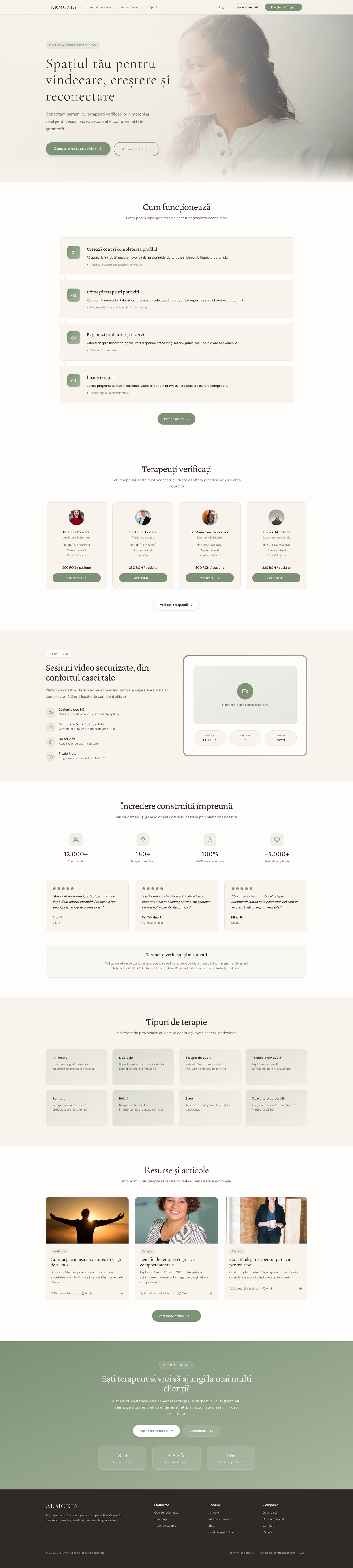
An online therapy platform connecting people with certified therapists through intelligent matching, secure video sessions and a warm, easy-to-use dashboard.
Home — Full Page
main flows designed (client, therapist, matching)
distinct pages / screens in the design
versions iterated in Figma Make
responsive — desktop and mobile
Client (patient)
Person aged 25–45 seeking psychological support. Anxious about the first step, needs a simple, human and confidential process.
Therapist
Certified psychologist or psychotherapist who wants a professional platform to manage their clients, sessions and public profile.
- Visual calm — warm neutral palette, generous white space, no visual noise
- Trust through transparency — therapist credentials, reviews and pricing visible upfront
- Guided onboarding — progressive disclosure reduces cognitive load at every step
- Privacy as a design value — confidentiality cues embedded throughout the UI, not just in legal text
- Serif + sans pairing — editorial typography signals warmth and professionalism simultaneously
- Consistent spatial rhythm — 4px base grid ensures visual harmony across all screens
- Accessible contrast — all text passes WCAG AA on both light and card backgrounds
- Emotional safety — no clinical blue; warm sage and ivory reduce anxiety and build comfort
- Micro-interactions — subtle hover states and transitions reinforce responsiveness without distraction
- Mobile-first layouts — every screen designed for thumb reach and small viewports first
Colour palette
Brand / Semantic
Neutral
Feedback
Green Scale
Healing
Display / Logo · Serif
Cormorant Garamond
Hero headings, brand name, editorial titles
Wellness
Section Headings · Serif
Crimson Pro
Section titles, large callouts
Aa
UI / Body · Sans-Serif
DM Sans
Body copy, navigation, buttons, labels
Spacing System
4px
Base grid unit
4 · 8 · 12 · 16 · 20 · 24 · 32 · 40 · 48 · 64px
Border Radius
10px
Default card radius
2 · 4 · 6 · 8 · 10 · 16 · 24 · full
Motion
200ms
Default transition
150ms hover · 200ms default · 300ms modal · 500ms page
Accessibility
AA
WCAG 2.1 target
All text passes AA on both light and card backgrounds
Landing Page
Hero with matching CTA, verified therapists, testimonials and therapy types.
Client — Dashboard
Next-session card, scheduled sessions and saved therapists at a glance.
Therapist — Profile
Public profile editor with photo upload, intro video and credentials.
Therapist — Availability
Weekly time-slot grid for managing available therapy hours.
Admin — Dashboard
Platform overview with therapist and session stats and pending applications.
Admin — Payments
Payments table with totals, refunds and status badges.
Armonia is built around three distinct user types — each with a dedicated dashboard and tailored workflows. Every pillar was designed independently to meet the specific needs of its audience.
Find and book a therapist, join video sessions, track progress, and manage upcoming appointments — all from a calm, guided dashboard.
Manage your schedule, view today's sessions, track revenue, review client notes, and maintain your public profile — in one professional workspace.
Oversee the entire platform — manage therapist approvals, monitor usage, handle content, and maintain quality standards across the system.
Discover
- User interviews
- Competitor audit
- Problem framing
Define
- Personas
- User flows
- Information architecture
Design
- Wireframes
- Visual design
- Prototype
Validate
- Usability testing
- Iteration
- Handoff
Key findings
of users felt overwhelmed choosing a therapist without upfront pricing and reviews.
was the original onboarding length — reduced to 3 after testing showed drop-off at step 4.
test users expected a "free first session" option — now surfaced on therapist profiles.
User voices
"I want to see the therapist's face and read reviews before I decide — I need to feel safe before I book anything."
Ana, 29 — potential client
"My biggest frustration with existing platforms is that clients ghost me after booking. I need tools to manage my schedule properly."
Dr. Elena, 38 — therapist
Key takeaways
- Users need social proof (reviews, credentials) from the very first contact with a therapist
- Simplifying onboarding from 5 steps to 3 reduced perceived drop-off
- Warm colours (nude, sage green) outperform clinical blue in a wellness context
Next steps
- Usability testing with real users (5–8 participants)
- Expand with a personal client journal module
- Full handoff to development with design tokens
Armonia is a concept platform — but designed with real production metrics in mind. These are the KPIs I'd track post-launch to validate design decisions.
Task Completion
≥ 85%
Users who complete the therapist matching flow without dropping off
Time to Book
< 4 min
From landing page to confirmed first session booking
Onboarding Drop-off
< 20%
Users who abandon the 3-step onboarding before completing it
Return Rate
≥ 60%
Clients who return to book a second session within 30 days
All colour combinations were verified against WCAG 2.1 AA standards. Text contrast, interactive states and focus indicators were tested across both light card and background surfaces.
Contrast ratios
Body text on background
#2F2A27 on #F5F0E5
13.2:1
AAAPrimary CTA on background
#5A7055 on #F5F0E5
5.1:1
AAMuted text on card
#6F6A65 on #FFFFFF
5.8:1
AAHeading on card
#2F2A27 on #FFFFFF
15.3:1
AAAWhite on primary button
#FFFFFF on #7E9276
3.9:1
AAAccessibility checklist
Keyboard navigation on all interactive elements
Focus-visible rings on buttons, links and inputs
ARIA labels on icon-only buttons
Form fields with visible labels — no placeholder-only
Error states in text, not colour alone
Touch targets ≥ 44×44px on mobile
Reduced motion support for animations
Screen reader testing (NVDA / VoiceOver)
Items marked incomplete are flagged for the next iteration — reduced motion and screen reader testing require a live prototype.