Claudia Beauty — Booking App
"A premium salon in your pocket — warm, dark, editorial."
A dark-luxury beauty-studio booking app for iOS — clients browse services, save favourites, and book appointments through a warm, editorial flow, while the studio manages services, locations, appointments and reviews from a dedicated admin app.
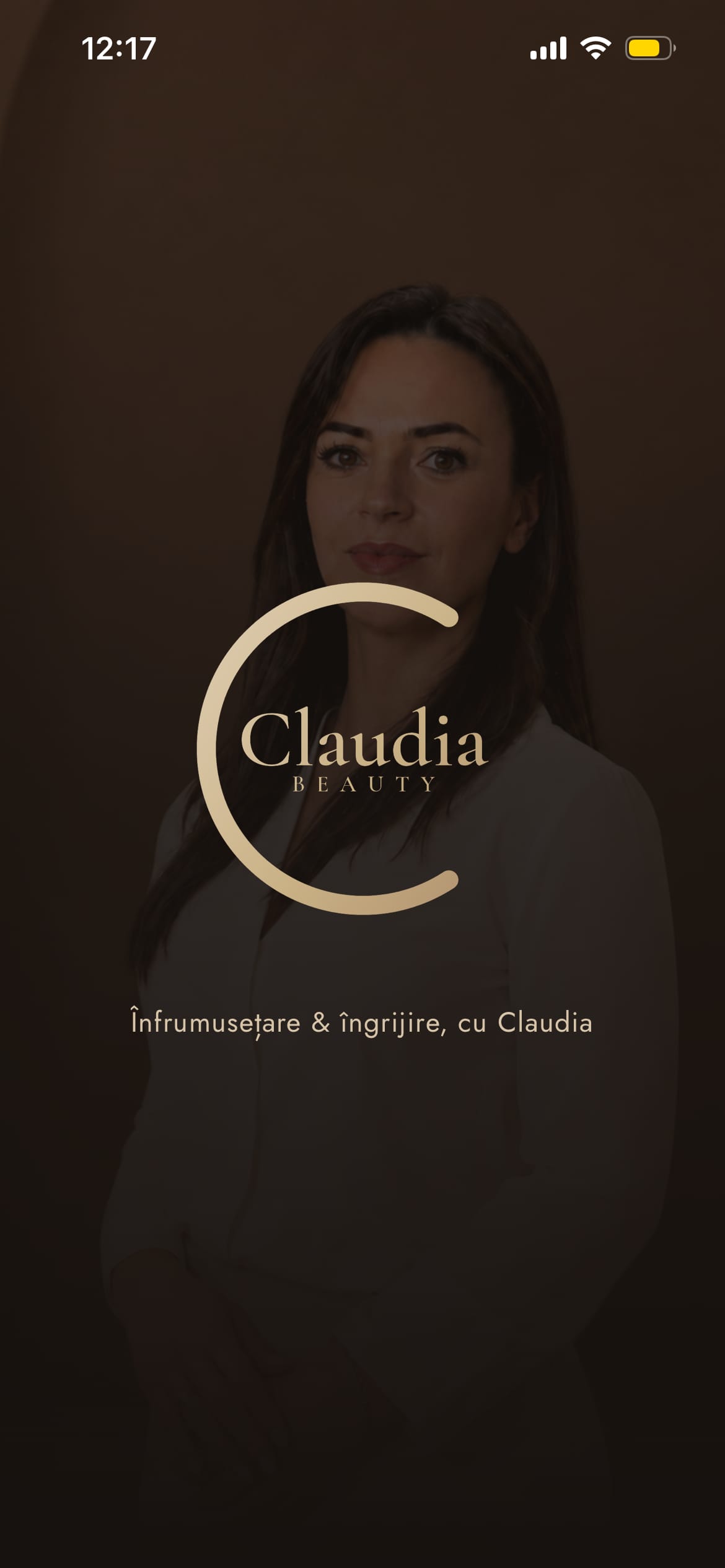
Splash
apps designed — client + admin — one design system
screens across client and admin flows
native, built with React Native + Expo
signature cream checkout sheet in a dark app
Client
Someone booking a beauty appointment on their phone. Wants to browse services, see availability, book in a few taps, and feel the studio's premium vibe before ever walking in.
Studio / Admin
The studio owner or staff managing multiple salons — services, categories, appointments, reviews and stats — from a dedicated admin app with the same visual language.
- Warm dark by default — espresso and chocolate backgrounds, never cold white or bright pink
- Serif display + sans UI — Cormorant Garamond headings over clean Jost body
- One cream sheet — the light inverted surface is reserved for checkout / confirmation only
- Gold as accent, not fill — champagne/gold on overlines, active states and the primary CTA
- Overline-above-title pattern — small tracked uppercase label above every serif title
- Soft warm shadows — one soft lift on cards, a gold glow only on the primary CTA and Book tab
- Rounded, generous shapes — large radii, big tap targets, airy spacing
- Editorial service cards — image-led grids with favourite affordances
- Subtle, expensive motion — spring press states and slow cross-fades, never bouncy-loud
- One identity across two apps — client and admin share tokens, type and components
Colour palette
Surface — Dark
Accent — Gold
Cream Sheet
Beauty
Display / Headings · Serif
Cormorant Garamond
Hero titles, screen headings, editorial display over photos
Aa
UI / Body · Sans-Serif
Jost
Body, labels, prices, buttons and overlines
Platform
iOS
React Native + Expo
Expo · React Navigation · Reanimated · Supabase backend
Radii
18px
Default card radius
12 sm · 18 md · 24 lg · 32 xl · 999 pill
Motion
0.96
Press scale spring
Spring press 0.96–0.98 · fade/slide transitions · confirmation spring-in
Depth
Soft
One warm shadow
Soft warm card shadow · gold glow on primary CTA and Book tab only
Claudia Beauty is two apps sharing one dark-luxury identity — a client app built around browsing and booking, and an admin app that lets the studio run every location without breaking the brand.
Browse services, save favourites, and book in a few calm taps — a warm, guided journey that feels premium from splash to confirmation.
Choose services → date → time → details → a single inverted cream checkout sheet → a springing confirmation. The one light surface in the whole app marks the transactional moment.
Dashboard, appointments, service/category/location management, reviews, schedule and stats — the studio's workspace, in the same espresso-and-gold language as the client app.
Discover
- User interviews
- Competitor audit
- Problem framing
Define
- Personas
- User flows
- Information architecture
Design
- Wireframes
- Visual design
- Prototype
Validate
- Usability testing
- Iteration
- Handoff
Key findings
the default booking channel for beauty studios — no visible availability and no history for the client.
for beauty, perceived quality is emotional; a clinical or cheap UI breaks trust before the first booking.
the studio operates more than one location, so salon selection and per-salon management were first-class from the start.
User voices
"I want to see what's available and just book — not wait for a reply to my DM. And it should feel as nice as the salon does."
Client, 27
"I manage two salons. I need appointments, services and reviews in one place, not five apps and a notebook."
Claudia — studio owner
Key takeaways
- A premium feel on mobile comes from restraint and warmth — dark surfaces plus one accent read as luxury
- Inverting to a single cream sheet for checkout makes the transactional moment feel distinct and trustworthy
- Designing client and admin together keeps the brand intact where most apps let the admin side go generic
Next steps
- Usability testing with real salon clients (5–8 participants)
- Push-notification reminders and rebooking prompts
- In-app payments and deposits at checkout
- Android build and App Store / Play Store submission polish
A shipped iOS product — these are the outcomes the client and admin flows were designed to drive.
Time to Book
< 90s
From opening the app to a confirmed appointment
Booking Completion
≥ 80%
Clients who reach checkout and complete the booking
Screens Shipped
25+
Across client and admin, on one shared design system
Admin Autonomy
100%
Salon, service and appointment management without a developer
The palette is intentionally warm and dark, so every text pairing was checked for contrast on both the espresso surfaces and the single cream checkout sheet, with large tap targets throughout.
Contrast ratios
Cream text on espresso
#FFF7EE on #17120F
15.8:1
AAASecondary text on espresso
#D8C6B4 on #17120F
9.4:1
AAAGold accent on espresso
#C6A06A on #17120F
5.6:1
AAInk on cream sheet
#241B15 on #F4EDE3
12.1:1
AAAMuted on cream (large only)
#8B7A68 on #F4EDE3
3.6:1
AAAccessibility checklist
Big tap targets on every card, chip and button
Cream sheet keeps ink contrast AAA for checkout copy
Status communicated with text + colour, not colour alone
Press states (spring scale) give clear tap feedback
Dynamic Type / font scaling support
VoiceOver pass across the booking flow
Dynamic Type and a full VoiceOver pass are the next accessibility items for the client booking flow.
Want to discuss this project?
Get in touch