DeLys Hoops — Basketball Media
"Basketball beyond the score — a sports magazine that reads like a notebook, not a ticker."
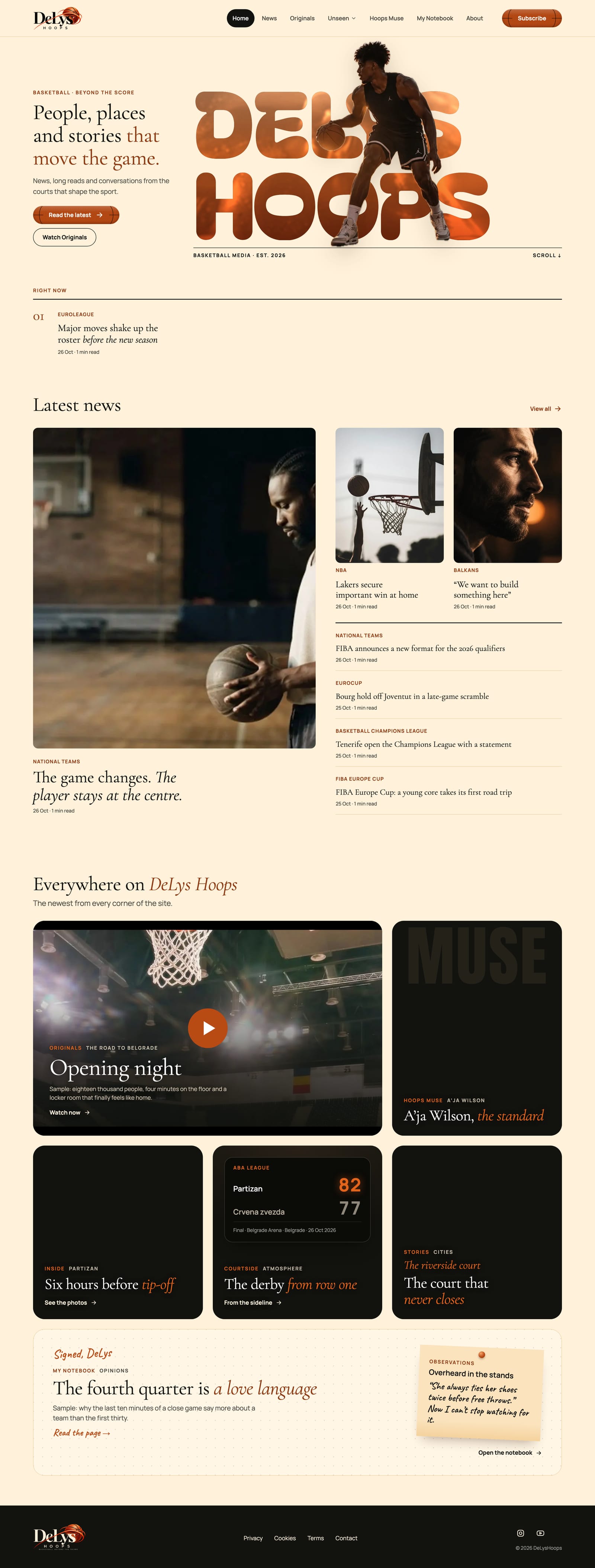
An editorial basketball publication — news, long reads, original films and personal notes from the courts that shape the sport — paired with a custom Studio where one editor writes, schedules, scores games and sends push alerts without touching code.
Home
public page types, each with its own editorial voice
token contrast pairs pass WCAG 2.2 AA
custom Studio replacing the stock CMS admin
push alerts a week at most — a promise made at opt-in
Reader
A basketball fan who follows European and NBA basketball, mostly on a phone. Wants the story behind the result, a reason to come back, and alerts only when it matters — not a feed of noise.
DeLys — Editor in chief
Founder and only full-time writer. Posts between games, often from a phone. Needs drafts, previews, scheduling and game scores that are quick to make and hard to get wrong.
- Paper and night — Soft Amber for reading, near-black for films and drama, nothing cold or grey
- One orange, many jobs — basketball orange for accents, buttons and the italic emphasis in every headline
- The ball is the button — primary actions are leather basketballs with seams, sheen and pebbled grain
- Serif story, sans interface — Cormorant Garamond display over Manrope UI
- Italic emphasis in orange — the editor marks it with *stars* in the title, the design does the rest
- Every section has a voice — notebook paper, fiery Muse, cinematic Originals — inside one token set
- Numbered chapters — every Heading 2 in an article becomes 01, 02, 03 for long-read rhythm
- Contrast is checked, not eyeballed — text only uses token pairs the checker verified
- The Studio speaks the same language — the back office uses the site's own type and paper
- Hard to publish half-finished — previews everywhere, alt text required, a ready-to-publish checklist
Colour palette
Paper
Night
Basketball Orange
Hoops
Display / Headlines · Serif
Cormorant Garamond
Headlines, section titles and the italic orange emphasis in every title
Aa
UI / Body · Sans-Serif
Manrope
Body copy, labels, navigation, buttons and the whole Studio interface
Stack
Next.js
Next.js 16 + Payload CMS 3
Postgres in production · SQLite locally · Vercel Blob media · Resend email · Sentry
Reach
SEO
Built for Google News
NewsArticle JSON-LD · Open Graph · canonical · sitemap · RSS · ISR
Engage
PWA
Install + web push
Service worker · push alerts capped at 3/week · newsletter sign-up
Quality
43/43
Contrast pairs, AA
Token contrast checker · Vitest + Playwright e2e · Semgrep, gitleaks, npm audit in CI
DeLys Hoops is a publication and the newsroom behind it — one reading experience with many section voices, and a Studio that lets a single editor keep it alive.
Home, News, articles with numbered chapters, Originals, Hoops Muse, Stories and My Notebook — each section with its own mood, all on one paper-and-night system. NewsArticle JSON-LD, RSS and sitemap so Google News finds every story.
Most readers arrive from a phone, often from a push alert. Big serif headlines, one-thumb section chips, installable as an app and alerts capped at three a week — the promise made at opt-in.
A custom back office in the site's own language: a dashboard of readers and drafts, posts with live previews and scheduling, one-form game scores, films and series, push alerts with a lock-screen preview, newsletter and subscribers.
Discover
- User interviews
- Competitor audit
- Problem framing
Define
- Personas
- User flows
- Information architecture
Design
- Wireframes
- Visual design
- Prototype
Validate
- Usability testing
- Iteration
- Handoff
Key findings
mainstream basketball sites lead with results and stat tables; the human story is an afterthought, if it exists at all.
the editor posts between games and on the move, so every Studio task had to work quickly and safely on a phone.
sports apps push constantly; capping alerts at three a week and saying so at opt-in turns them into something readers keep on.
User voices
"I don't need another app telling me the score. I want to know who these people are and why that game mattered."
Reader, 31
"I write in the stands, on my phone. If publishing takes ten steps, I'll never post on time."
DeLys — founder and editor
Key takeaways
- A strong single accent lets each section change mood without the brand falling apart
- Designing the editor's workflow is as much UX as the reader's — the Studio decides how good the site stays
- Putting contrast rules in the tokens, with a checker, kept accessibility intact through dozens of late design changes
Next steps
- Paid Originals — Stripe checkout and signed, buyer-only film playback
- Usability sessions with readers on the article and Originals flows
- Newsletter issue builder inside the Studio
- Follow a team — personalised push alerts beyond "Everyone"
An MVP built to grow a loyal readership — these are the targets the site and Studio were designed to move.
Time to Publish
< 5 min
From a new post in the Studio to live on the site, photo and preview included
Read Depth
≥ 60%
Readers who reach the second chapter of an article
Push Opt-in Kept
≥ 80%
Subscribers still opted in after a month, thanks to the 3-a-week cap
Editor Autonomy
100%
Posts, scores, films, alerts and pages managed without a developer
Accessibility lives in the tokens: text may only use colour pairs listed in the contrast checker, which verifies all 43 of them against WCAG 2.2 AA — including the orange buttons and glass buttons over photos.
Contrast ratios
Ink on Soft Amber paper
#12120E on #FFF1DA
16.9:1
AAAMuted text on paper
#4F4A43 on #FFF1DA
7.9:1
AAAAccent text on paper
#8F3A12 on #FFF1DA
6.8:1
AAOrange text on night
#E3641A on #12120E
5.5:1
AAWhite on basketball button
#FFFFFF on #B84A14
5.2:1
AAAccessibility checklist
All 43 token text pairs pass WCAG 2.2 AA, checked by script
Visible focus rings tuned per surface (paper, night, orange)
No text below 12px; display-faint colour never used for body copy
Alt text required before a post can be published
Reduced-motion support for hero and scroll animations
Screen-reader pass across article and Studio flows
A full screen-reader pass of the article and Studio flows is the next accessibility milestone.
Want to discuss this project?
Get in touch