Darius — Photography Portfolio
"Natural, cinematic wedding photography — a portfolio that turns emotion into bookings."
A calm, editorial website for a wedding photographer, designed so couples can feel the work, understand what's offered, and reach out in a single tap. Every page lets the photography lead — building trust and emotion instead of pushing a sale.
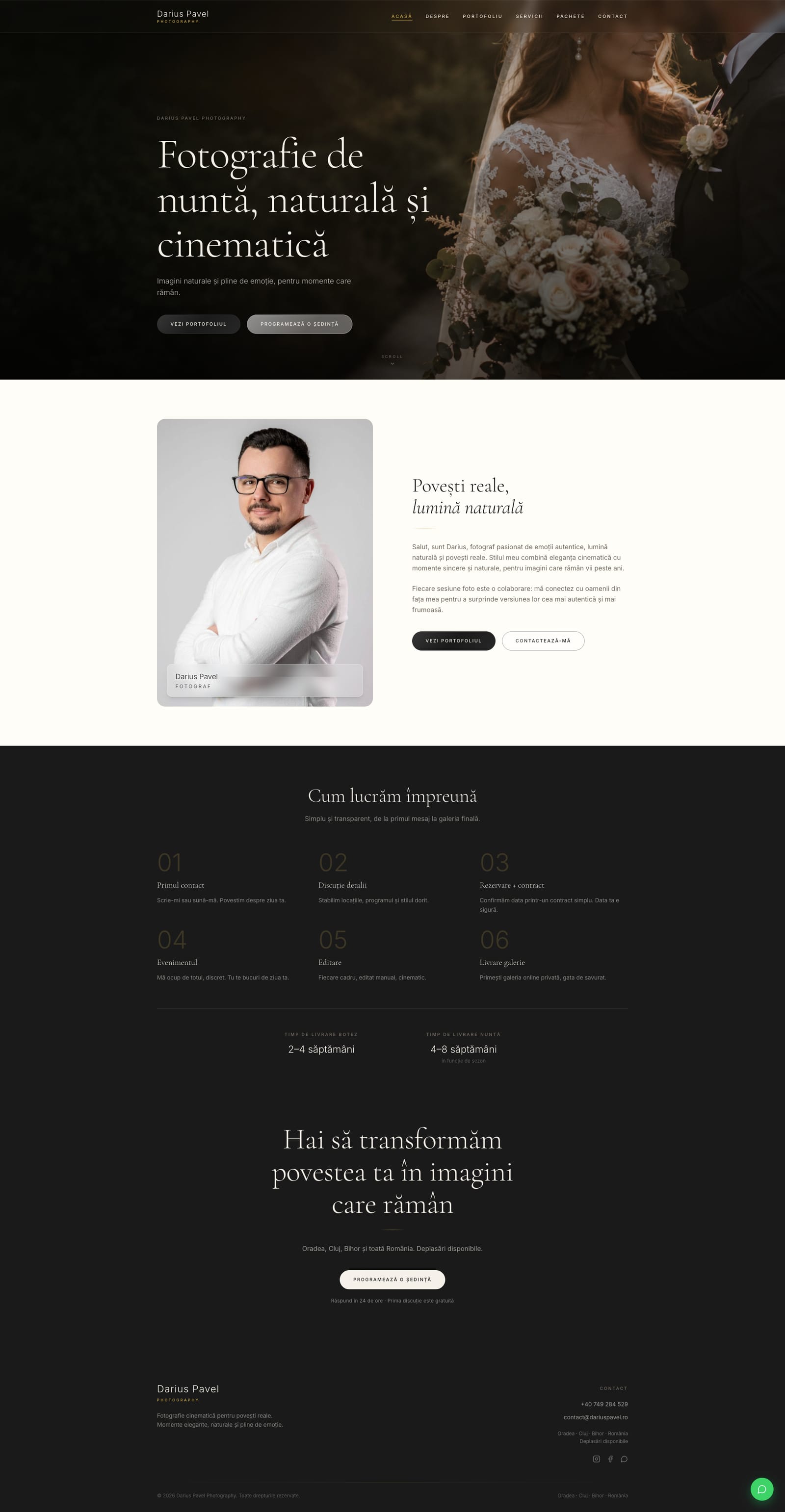
Home — Full Page
public pages designed and built
content types managed from the admin CMS
responsive — mobile-first, one tap to contact
WCAG 2.1 contrast target across the palette
Couples & families
Romanian couples and families (mostly Oradea, Cluj and Transylvania) booking a photographer for a once-in-a-lifetime moment. Arrive on a phone, emotionally invested, comparing a few photographers — deciding on feeling, not features.
Studio owner (admin)
Runs the studio — manages projects, services, packages, testimonials and contact messages through the password-gated /admin panel, keeping the whole site current without a developer.
- The photograph is the hero — chrome recedes, imagery leads every page with full-bleed heroes
- Quiet confidence over persuasion — trust is earned by showing work, never by urgency theatre
- Editorial calm — generous spacing, deliberate pacing, a serif/sans pairing that reads like a print album
- Frictionless to reach out — contact, WhatsApp and booking are always one tap away
- One coherent voice — public site and admin share tokens, type and interaction grammar
- Restraint with gold — the accent is a 1px thread (dividers, focus, hovers), never a large fill
- Cinematic, slow motion — a single signature easing for entrance reveals, not decoration
- Reduced-motion first-class — every reveal, marquee and carousel has a prefers-reduced-motion path
- Warm neutrals only — cream and ivory surfaces, never cold white or bright pink
- Romanian, human copy — warm and emotional, about memory and feeling, not specs
Colour palette
Canvas & Surface
Ink & Text
Accent — Gold
Decorative & State
Stories
Display / Headings · Serif
Cormorant Garamond
Hero titles, page headings, editorial display — large, airy, with italics
Aa
Body / UI · Sans-Serif
Inter
Body copy, navigation, buttons, labels and eyebrows
Stack
Vite
React + React Router + SSG
React 18 · Vite · react-router-dom · prerendered public routes
Data
Neon
Postgres + Vercel Blob
Serverless functions (@vercel/node) · Neon Postgres · Vercel Blob for images
Motion
0.22,1,0.36,1
Signature cinematic ease-out
0.3–1.4s reveals · staggered clip-path hero · reduced-motion paths
Accessibility
AA
WCAG 2.1 target
Warm-neutral contrast verified; gold accent decorative-only
The site is organised around the three things a visitor needs to decide, in order: see the work, understand the offer, and reach out — each a focused, full-bleed surface.
A filterable portfolio of full wedding, baptism and family stories — cover-led grid, category filters, and an immersive project detail with a lightbox gallery.
Services and packages presented as an editorial spread — numbered, photographic, benefit-led, with a single quiet "request a quote" call to action instead of pushy pricing.
About, testimonials and a frictionless contact funnel with WhatsApp one tap away — the trust-and-reach layer that turns a browse into a booking.
Discover
- User interviews
- Competitor audit
- Problem framing
Define
- Personas
- User flows
- Information architecture
Design
- Wireframes
- Visual design
- Prototype
Validate
- Usability testing
- Iteration
- Handoff
Key findings
most couples browse and compare photographers on mobile, so every layout was designed thumb-first with contact one tap away.
a visitor is usually comparing a few photographers at once — the work has to earn trust in the first few seconds of the hero.
the booking decision is emotional, so copy speaks about memory and emotion, never megapixels or gear.
User voices
"I want to feel the photographer, not read a price list. Show me a whole wedding and I'll know if it's the right person."
Andreea, 28 — bride-to-be
"I update everything from my phone between shoots — I can't wait on a developer to add a new gallery or change a package."
Studio owner
Key takeaways
- For emotional purchases, showing the work beats describing it — the portfolio grid does more selling than any copy
- A single restrained accent reads more premium than a full brand palette — gold works hardest as a hairline
- A self-service CMS is a design deliverable, not an afterthought — the studio's tools must feel like the studio's brand
Next steps
- Real client galleries and delivery links inside project detail
- Availability calendar and deposit flow wired into the contact funnel
- Testimonials with source verification and a Google-reviews import
- Custom domain (dariuspavel.ro) and full SEO / Open Graph pass
A shipped product — these are the KPIs the funnel and CMS were designed to move once real client work populates the site.
Inquiry Conversion
≥ 6%
Visitors who submit the contact form or open WhatsApp from a session
Time to Contact
< 60s
From landing to the contact/WhatsApp tap on mobile
Content Autonomy
100%
Site content the studio can edit without a developer
Portfolio Depth
15+
Full stories the grid is architected to hold without redesign
The warm cream palette is the main contrast risk, so every text pairing was verified against WCAG 2.1 AA. Where the brand accent can't meet AA, it's used deliberately as decoration with redundant cues, never as essential small text.
Contrast ratios
Charcoal ink on cream
#1A1A1A on #F5F0E8
15.1:1
AAAWarm-gray labels on cream
#736A5F on #F5F0E8
4.68:1
AAPlaceholder text on ivory
#7C7164 on #FFFDF7
4.69:1
AABody on ivory card
#1A1A1A on #FFFDF7
16.4:1
AAAGold accent (decorative only)
#C9A84C on #F5F0E8
2.0:1
—Accessibility checklist
Warm-gray deepened (#8C8075 → #736A5F) so all labels/body clear AA
prefers-reduced-motion path for reveals, hero, marquee, shimmer, carousel
Visible gold :focus-visible rings on all interactive elements
Touch targets ≥ 44×44px on mobile
Romanian content with correct diacritics; descriptive alt text
Gold-as-text kept ~2:1 only for large display italics with redundant cues
Full screen-reader pass on the booking funnel
Gold #C9A84C as text is a deliberate, documented tradeoff — preserved as a brand accent on large display type with underlines/other cues, never for essential small body copy.
Want to discuss this project?
Get in touch