Random FOOD — Recipe Discovery App
"Let the world decide what's for dinner — one tap, one real dish."
A playful iOS app that answers "what should I cook tonight?" with one tap. Pick a meal type and a continent, and Random Food serves a real dish from that corner of the world — already filtered around your allergies and the ingredients you never want to see.
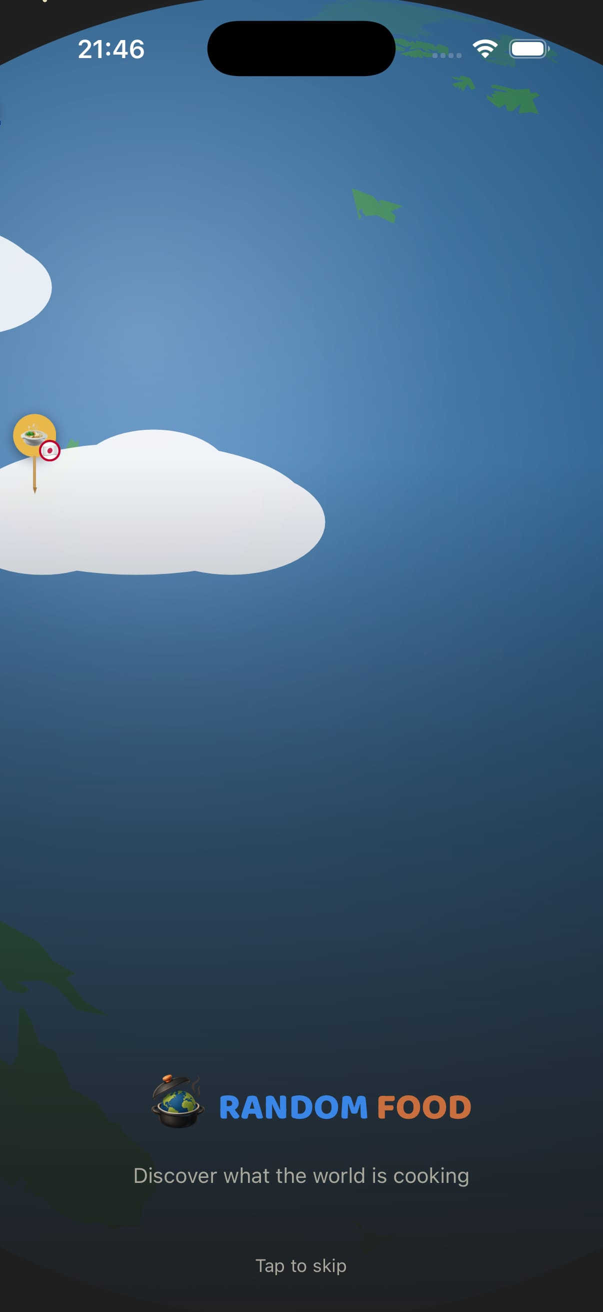
Splash
recipes across six continents
from opening the app to a real dish
languages — English and Romanian
native, built with React Native + Expo
The undecided cook
Someone standing in their kitchen at 6pm with no plan. Wants a decision made for them, not a catalogue to browse — and wants it to be something they'd actually eat.
The constrained eater
Has a real allergy or a short list of ingredients they refuse. Needs those filtered silently on every result, without re-declaring them each time.
The bored-of-the-rotation cook
Cooks the same six meals on a loop. Uses the continent filter to deliberately land somewhere unfamiliar.
- One tap to an answer — the product fails if the user has to think before it helps
- Ask once, never again — allergies and dislikes are collected in onboarding and applied silently forever after
- Dark charcoal base, warm cream ink — never cold grey, never clinical white
- One orange gradient per screen — the burnt-orange CTA is the single primary action, never decoration
- Blue means selected — ocean blue is reserved for active state, so selection is never ambiguous
- Rounded and generous — large radii, big tap targets, everything centred
- Playful, not childish — Baloo 2 display over Quicksand body carries warmth without cartoon
- Real dishes, real places — every result names its country and continent, never a generic fusion
- Filters are invisible — the constraint work happens off-screen, not in the user's way
- Emoji as texture, icons as chrome — food emoji warm the light surfaces, SVG line icons handle real UI
Colour palette
Surface — Dark
Accent — Action
Ink & Support
Random
Display / Headings · Rounded Sans
Baloo 2
Screen headings, recipe titles, logo and every button label
Aa
UI / Body · Geometric Sans
Quicksand
Body copy, inputs, chip labels, meta rows and hints
Platform
iOS
React Native + Expo
Expo Router · Reanimated · Skia · AsyncStorage · expo-image-picker
Recipes
504
Six continents
84 dishes per continent · localised EN / RO · allergy and dislike filtering
Radii
18px
Default button radius
16–20 chips and inputs · 18–26 buttons · 24–30 cards · fully round avatars
Depth
Glow
One coloured lift
Soft shadows on dark cards · orange glow reserved for the primary CTA
Random Food is built around a single loop — declare your constraints once, then tap for a dish as many times as you like. Each pillar removes a different reason the user might have to stop and think.
A three-step onboarding collects allergies, dislikes and a profile, then gets out of the way. Every result afterwards is filtered against those answers without ever mentioning them again.
Meal type, and an optional continent. "Surprise me" is pre-selected so the app is usable with zero input — the orange CTA is always the only thing left to press.
The result is a named dish from a named country — full-bleed photo, time, difficulty, servings, ingredients in two columns and numbered steps. Save it, or tap Random again.
Discover
- User interviews
- Competitor audit
- Problem framing
Define
- Personas
- User flows
- Information architecture
Design
- Wireframes
- Visual design
- Prototype
Validate
- Usability testing
- Iteration
- Handoff
Key findings
the "what should I cook" decision recurs every single day, which makes even small friction compound into abandonment.
a searchable recipe library only serves users who already know what they want — the opposite of the indecisive case.
allergies are absolute, not preferences; a suggestion containing one is worse than no suggestion at all.
User voices
"I open a recipe app, scroll for ten minutes, close it, and make pasta again. I don't want options — I want someone to just tell me."
Cook, 31
"Every app makes me re-tick "no seafood" every time. I've told you already."
Cook with a shellfish allergy
Key takeaways
- A decision app and a browsing app are opposite products — adding search would have quietly destroyed the premise
- Splitting dietary input into "allergies" and "dislikes" matters more than it looks: one is a safety filter, the other a preference weight, and collapsing them would make the app either unsafe or annoying
- Committing to one accent gradient per screen made hierarchy obvious without a single extra layout rule
Next steps
- Usability testing with 5–8 cooks in a real kitchen at a real dinner hour
- Shopping-list export from a recipe's ingredient list
- Weekly meal planning built on the same one-tap primitive
- Android build and Play Store submission
A shipped App Store product — these are the outcomes the one-tap loop was designed to drive.
Time to Dish
< 5s
From opening the app to a full recipe on screen
Taps to Result
1
With defaults, no input required before generating
Recipe Library
504
Real dishes across six continents
Constraint Safety
100%
Declared allergies filtered from every result
The app runs on a dark charcoal base with a warm cream ink ramp, so every pairing was checked against the dark surfaces — and selection state is never carried by colour alone.
Contrast ratios
Cream text on charcoal
#F7F2D8 on #1F1F1F
15.1:1
AAASecondary text on charcoal
#A8A89C on #1F1F1F
8.2:1
AAACream text on raised surface
#F7F2D8 on #2A2A2A
12.9:1
AAAOcean blue on charcoal
#3A86E6 on #1F1F1F
4.6:1
AACream on burnt orange CTA
#F7F2D8 on #C96E3D
4.1:1
AAAccessibility checklist
Tap targets at least 44×44 across chips, cards and buttons
Selected chips carry a check icon, not just a fill colour
Every screen has exactly one primary action
Full English and Romanian localisation
Dynamic Type / font scaling support
VoiceOver pass across the generate-and-save loop
Dynamic Type and a full VoiceOver pass are the next accessibility items, alongside a reduced-motion path for the plating animation.
Want to discuss this project?
Get in touch