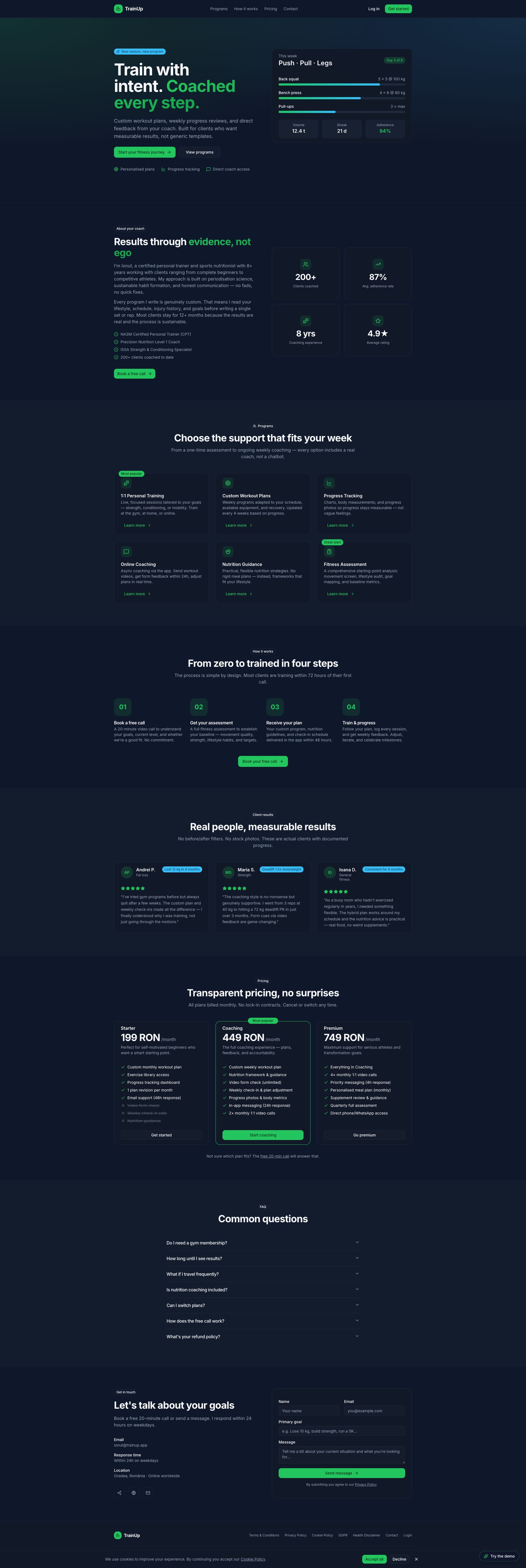
TrainUp — Fitness Coaching Platform
"Train with intent. Coached every step."
A dual-role coaching platform connecting personal trainers with their clients — featuring custom workout plans, adherence tracking, progress analytics and async messaging in one cohesive dark-themed product.
Landing Page
screens designed across trainer and client flows
distinct dashboards — one per user role
adherence score tracked in real time per client
responsive — dark-themed, desktop-first SaaS
Personal Trainer
Manages 2–15 clients simultaneously. Needs to build custom workout plans, monitor adherence, track progress photos, schedule sessions and send coaching messages — all without switching tools.
Client (Trainee)
Follows a structured training programme. Wants to see their weekly plan clearly, log workouts, track body metrics over time and message their trainer with questions or form check requests.
- Role clarity — trainer and client flows are completely separate, each optimised for its audience
- Data at a glance — key metrics (adherence, streak, volume) surface on the dashboard without drilling down
- Dark SaaS aesthetic — deep navy + vibrant green creates a professional, energetic fitness brand
- Progress visibility — weight trends, photo timelines and session logs make improvement tangible
- Async coaching — messaging designed for thoughtful coach replies, not real-time chat pressure
- Component consistency — 50+ shared UI primitives ensure visual rhythm across all screens
- Motivating feedback — adherence thresholds use colour semantics (red / yellow / green) to prompt action
- Mobile-friendly layouts — sidebar collapses cleanly, cards reflow for smaller viewports
Colour palette
Brand
Surface
Status
Charts
Aa
Primary / UI · Sans-Serif
Inter
All UI text — headings, body, labels, buttons, navigation
Train
Body / UI · Sans-Serif
Inter
Paragraph text, descriptions, secondary labels
94%
Monospace / Code · Monospace
JetBrains Mono
Metrics, values, adherence scores, data labels
Spacing System
4px
Base grid unit
4 · 8 · 12 · 14 · 16 · 20 · 24 · 32 · 40 · 48px
Border Radius
12px
Default card radius (--radius)
8px sm · 10px md · 12px lg · 16px xl · full pill
Motion
200ms
Default transition
150ms fast · 200ms normal · 300ms slow · 500ms slower
Accessibility
AA
WCAG 2.1 target
All text passes AA — dark surface with light text optimised throughout
Trainer — Dashboard
Active-client stats, adherence-tracked roster and upcoming sessions overview.
Client — Dashboard
Personalized home with adherence, weight, today's workout and plan progress.
Workout Plans
Client program cards showing weekly training days, phases and progress.
Progress Tracking
Body-weight chart, log-weight form and adherence history.
Session Calendar
Weekly grid of scheduled client session blocks across days.
Exercise Library
Filterable exercises by muscle, equipment and level with edit actions.
TrainUp serves two distinct user types — each with a completely separate dashboard tailored to their workflow. The trainer workspace is management-focused; the client portal is progress-focused.
Manage the full client roster, build custom workout plans from reusable templates, track adherence per client, schedule sessions, review progress photos and send coaching messages — all from one workspace.
View the assigned weekly programme, log completed workouts, track body weight and measurements over time, upload progress photos with visibility controls and message the trainer directly.
Discover
- User interviews
- Competitor audit
- Problem framing
Define
- Personas
- User flows
- Information architecture
Design
- Wireframes
- Visual design
- Prototype
Validate
- Usability testing
- Iteration
- Handoff
Key findings
is the average number of separate apps trainers use to manage clients — the core problem TrainUp solves.
required completely separate navigation architectures — trainer and client workflows have almost no overlap.
emerged as the highest-value feature for client motivation — more than charts or session logs.
User voices
"I spend more time updating spreadsheets and sending WhatsApp messages than actually coaching. I need everything in one place."
Andrei, 32 — personal trainer
"I never know what I'm supposed to do this week until my trainer texts me. I want to just open an app and see my programme."
Mara, 26 — fitness client
Key takeaways
- Two-role products need clear entry-point separation — combined login with role detection avoids confusion
- Adherence percentage is more motivating than raw completion counts — clients respond to the score
- Progress photos need explicit consent UX — visibility controls (trainer-visible vs private) are a trust feature
Next steps
- Usability testing with real trainers (5–8 participants)
- Nutrition tracking module — currently a placeholder awaiting full design
- Mobile app version for clients (workout logging on the go)
- Trainer analytics — revenue, session volume, client retention over time
TrainUp is a live production app — these are the KPIs designed into the product from day one to validate trainer and client engagement.
Adherence Tracked
94%
Live adherence score per client — the central metric trainers monitor daily
Screens Designed
20+
Across trainer and client dashboards — each optimised for its audience
Plan Build Time
< 5 min
Target time for a trainer to build a new client workout plan from scratch
Client Activation
≥ 80%
Clients who log their first workout within 48h of being onboarded
All colour combinations were verified against WCAG 2.1 AA standards on dark surfaces. The dark SaaS palette was specifically chosen to maintain high contrast throughout.
Contrast ratios
Body text on background
#f8fafc on #0f172a
19.3:1
AAAPrimary accent on background
#22c55e on #0f172a
6.1:1
AAMuted text on card
#94a3b8 on #111827
4.8:1
AAHeading on card
#f8fafc on #111827
17.4:1
AAADark on primary button
#052e16 on #22c55e
7.2:1
AAAAccessibility checklist
Keyboard navigation on all interactive elements
Focus-visible rings — outline-2 outline-offset-2 on all focusable elements
ARIA labels on icon-only buttons
Form fields with visible labels (react-hook-form + zod validation)
Error states shown in text, not colour alone
Touch targets ≥ 44×44px on mobile
Colour-blind safe palette — status communicated via text + colour
Reduced motion support for Framer Motion animations
Reduced motion is the next a11y item — Framer Motion has a useReducedMotion hook that will be wired in the next iteration.
Want to discuss this project?
Get in touch